


According to Jobsite.co.uk, “the average CV is only looked at for 10 seconds.” That’s because “typically a Recruitment Consultant might view several hundred CVs in a single day.” This means that your first impression is crucial.
Luckily, you can use some simple graphic design techniques to do just that. You don’t need to go overboard with garish colours and fancy fonts (there is such a thing as over designing), but the below techniques are subtle ways to give your CV the edge it needs.
Colour Theory
Colour can evoke emotion and using it sparingly in your CV, such as in headings or to section off your skills list, can help project a certain impression of you upon the reader.
Here are the emotions that the following colours can project, according to colour theory.
Red - passion, danger, importance, aggression. (Hint: use this colour wisely and sparingly – whilst it can attract attention, it can also be overbearing)
Orange - playfulness, warmth, energy
Yellow - can create mixed feelings - for some, happiness, optimism, for others, warning. (Hint: go for more natural hues rather than neon to give the right impression)
Green - nature, growth, harmony, stability
Blue - trust, serenity, inviting, fresh
Purple - luxury, romance, mystery, elegance
Pink - care, compassion, love, innocence,youth, fun
Brown - rustic, earthy, stable, longevity
Black - trendy, modern, sophisticated
White - simplicity, elegance, purity
Typography
Images from : https://www.crowdspring.com/blog/type-font-typography-business-brand-psychology/
The font or typeface that you choose can also create a strong impression in the reader’s mind. Think about what you want that impression to be before you go about choosing yours. Many brands and businesses take a lot of time choosing their typeface to convey a certain message to their customers, and you can do the same. Also, some fonts tend to be used more often by certain industries, so you could match your font to the industry you want to work in.
Here is some basic typography theory to get you started.
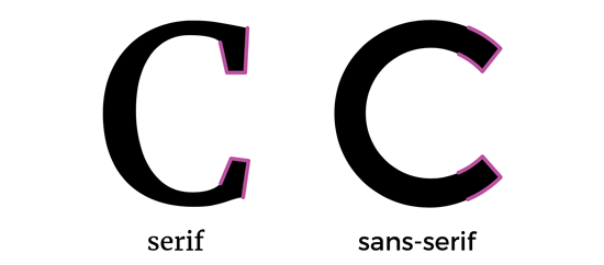
Sans or sans serif?
Serifs are the little flourishes at the end of letter strokes. Fonts always fall into one of these two categories. Serif fonts convey elegance, prestige, heritage and authority and tend to be used by finance, fashion, or journalism, for example, to give a feeling of luxury or reputability. Sans-serif (without serifs) fonts are more accessible, modern, friendly and clean and are used across most industries.
Here is a more detailed guide to fonts: https://www.canva.com/learn/font-design/
Hierarchy
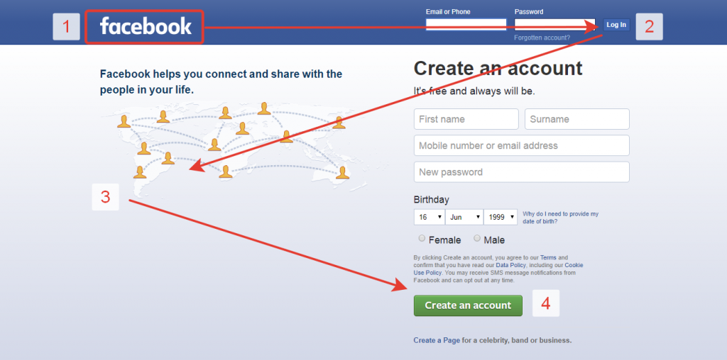
How do you want the viewer to read your CV? Is there some information you want to stand out more than others? Is there a particular order in which you want them to read the different sections? You can use visual hierarchy principles to guide viewers through your CV in a compelling way. Here are some key techniques you can get creative with.
Size - use larger headings and subheadings to draw the viewer’s eye. People tend to read bigger things first.
Colour contrast or boldness - use contrasting colours or bold font to make some elements stand out more
Positioning - Place the content you want the viewer to see first at the top of the page
Scanning patterns - people tend to scan a page first to see if they want to read it. They generally do this in one of two ways:
- F-patterns – tends to be used for text-heavy pages like articles and blog posts. For these types of pages you should align your important content left
- Z-patterns - for pages with varying blocks of content, like a website or an advert. If you’ve been creative with the layout of your CV, it probably falls into this pattern, so make use of headings, subheadings and other hierarchical techniques to guide readers from one section of your CV to the next
Spacing
Spacing is another great way to give your CV the competitive edge and can mean the difference between a clean, crisp, professional-looking CV and an overcrowded CV that is difficult for recruiters to read.
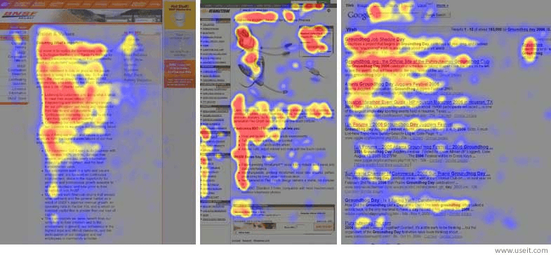
Whitespace - this refers to the space around visual elements. It’s a powerful and simple way to draw attention to a piece of information because the viewer will be less distracted by other elements. A great example of this is the Google homepage.
Readability - using spacing well makes your CV easier to read. Don’t try to cram as much information as possible onto the page, but be selective about what you include and give your content (and the viewer) room to breathe.
Want more tips to improve your CV? Click here: